Thursday 27 August 2020

Create branded presentations with Google Slides

With many of us working remotely, it’s never been more important for businesses to ensure everyone’s presentations are on brand. For lots of our clients, using professionally designed templates in the Google Slides program, has been the answer. The free web-based software, allows you to create presentations quickly and easily, using tailor-made slides. Perfect for saving time and an effective way of safeguarding brand guidelines.


Ensures Brand Consistency
Keeping corporate branding consistent can be difficult at the best of times, particularly in presentations where people often try to embellish their slides and stand out, ultimately struggling to keep messages on point. 

Although not as sophisticated as our usual design software – Google Slides can have custom designed templates tailored to your business, which can be enhanced with videos, drawings and animations while staying on brand. We can also take your existing PPT presentations and convert them into Google Slides, formatting them and adding imagery, while adapting them to your own branding.

Supports Co-editing 

The presentations are saved online within Google Drive so you can easily share your slides with others. Being able to edit the document in real time provides an opportunity for everyone to work on the same document at the same time (however not on the same page of the presentation). You decide who gets permission to edit, view or simply add comments.


Automatically saved on the cloud as you type, means the slides can be accessed wherever you are. No special software or subscription is needed and they easily work across PC’s, Mac’s, mobiles and tablets. Best of all it’s free! You can use the Google Drive space to store and create master presentation documents up to 15GB without it costing you anything at all.


User Friendly
Whether creating client facing presentations or simple documents purely for internal use, it’s always important to stick to brand identity guidelines. Templated slides make this easy and are extremely versatile no matter how you intend to use them. Your presentation can be imported as PowerPoint, yet your final document can be exported in different file types such as jpg or pdf. When it comes to giving your presentation it couldn’t be easier as the slides support wireless presenting with Chromecast, AirPlay and Hangouts. 


Time Saving 
Predesigned templates not only protect your all-important brand messaging, they significantly save time when preparing documents. No one is left wondering which font style has been approved, where the company logo should be placed or where the latest version is saved. The laboursaving templates are ready to go, easily editable and stored in a central location.

Being able to easily access the slides online, also removes the need to send documents back and forward between colleagues. There’s no need to worry about attaching large files or delays in receiving emails. By simply allowing access online, it saves time and boosts productivity.


More Information
If you’d like help creating your own professional templates which are easy to use and ensure your branding always remains consistent, give The New Fat design team a call on 0370 334 1598 or email studio@thenewfat.co.uk. We’d love to help you simplify your presentations and create efficient systems for you and your team.

Monday 7 October 2019

Create Cohesion with a Branding Workshop

Is your business at a crossroads in terms of brand identity and focus? A brand workshop could be the answer.


So… what on earth IS a “Branding Workshop”?
It is your key decision makers, a handful of staff and an experienced creative professional running through some tailor-made exercises designed to help you get a better understanding of your businesses core beliefs, its purpose and personality. Creating this clarity and insight gives you confidence to move your brand forward.

A creative change from the norm 

An inspiring experience for everyone taking part - move the workshop away from the usual office space, create a relaxed, positive environment with drinks and snacks and provide plenty of pens, post-it notes and flip charts. Start with an ice-breaker and encourage everybody to get involved. By injecting a little bit of fun and a change of routine you will spark creativity and clear ideas.
 
The aim
The aim of your workshop should be to find the following:
- brand purpose
- brand vision
- brand mission
- brand values
- brand personality
- target audience


Credit: Jake Knapp, GV Library

Brand Focus
There’s a whole host of exercises that will help develop and refine your brand ethos. By the end of the session (which can vary in length) the creative professionals will have all the information they need to put together a useful brand positioning document. Coupled with brand guidelines you will have a one-stop-shop for all your all important brand visuals, colours, fonts, ethos, missions and tone of voice.

Quick Example Exercise: Establishing Brand Vision
10 years from today, your company is all over social media for doing or achieving something inspired or simply brilliant!
Everyone writes 3 promotional twitter posts – summarising the achievement. The team discuss, suggest alternatives and evolve the best ones into a vision statement.


For example:
BBC - to act in the public interest, serving all audiences through the provision of impartial, high-quality and distinctive output and services which inform, educate and entertain.

Google - Organise the world’s information and make it universally accessible and useful.


More Information
If you'd like to organise a brand workshop for your business chat to Suze Moore our creative director. Or have you done the vision / values stage and need help producing a brand identity and brand guidelines? We're always full of good ideas - call us on 0370 334 1598 or email studio@thenewfat.co.uk


why not have a look at this months offer or read our latest case study

Thursday 1 August 2019

The Benefits of Professional Copywriting

New marketing material? Yes, it certainly should look good, but don’t forget compelling content too. That’s where a professional copywriter can play a vital role.

Why use a professional copywriter?
Some people have a natural talent with words. They know which ones to use when, and they always seem to be able to strike the right note. 

Unless you have someone with this ability in your team, it’s worth considering the advantages of professional copywriting support:

Quality
Just as good writing can really help your business, bad writing can be damaging. Sloppy language, poor grammar and typos are noticed and create a very poor impression. 

Using a good copywriter removes these risks. They’ll also be able to take what you tell them and craft it in a way which takes it to the next level – producing strong content which others want to read. Copywriting services make you look more professional, and can make anything sound exciting! 

Flexibility
Even when you’re clear what you want to convey, it will need to be tailored. You may be able to say what you want in 400 words, but what about 200 words, or in a tweet? 

You also have to adapt content to suit different audiences – customers, investors, staff, regulators etc. Modifying copy in this way to get the tone and language right without losing sense and consistency is a particular copywriting skill.

Capacity
Outsourcing copywriting creates more time for you. It means that important writing tasks aren’t left undone, simply because you haven’t got around to them. Like re-writing those web pages that are out of date and looking a bit tired.

A fresh eye
It is possible to be too close to a subject. When you’re working in a business every day, it can be all too easy to overlook how special it is – to be unable to see the wood for the trees. 

Using a professional copywriter provides an opportunity for someone to look at your business with a fresh eye. They start with zero knowledge and have to get to know you quickly. As a result, they ask of lots of obvious questions which can provide new insight for you.

The art of persuasion
Getting the balance right between explaining what you do, and the benefits of it, is a real skill. We Brits are not particularly comfortable promoting ourselves! As a result, some businesses fall into the trap of providing information without any “sell”.

Yes, you need to avoid waffle and get to the point. However, the strongest connections with audiences are emotional ones. Professional copywriters will use the right language to create rapport – answering that crucial question: “What’s in it for me?”

SEO
These days, a strong online presence is essential for any business. That’s why Search Engine Optimisation matters. You have to embed the right words and phrases in your content to help the likes of Google find you. This is bread and butter for full-time copywriters, and a major side-benefit for you.

Getting your story right
A brand is a complex thing. Yes, your company logo and visual identity is part of it, but ultimately it’s driven by what people think and feel when they hear your name.

This is why getting your story right is essential. Your core narrative makes it clear who you are, what you have to offer and why people should buy from you rather than someone else.

Your narrative doesn’t have to be that long, but it does take some thought. The support of a professional copywriter in this process can be invaluable. They will ensure that you say just enough and in the right way.

Once you’re sure your narrative is right, apply it with discipline across all your marketing – website, social media, promotional materials etc. This consistency gives a coherence to your brand – but only if your customer experience comes up to expectations! There’s nothing worse than making a claim which doesn’t stand up to scrutiny. 

Writing tips
Although we’ve explained why using a professional copywriter can bring real benefits, there’s absolutely no reason why you can’t do the basics yourself. So here are some tips to help you on your way:

Make your copy easy to read
Use a sensible font size, avoid dense text and long paragraphs. Keep your sentences short (no more than 25 words). If you’ve used an ‘and’ to connect clauses, try a full stop instead. If you’ve got a list, use bullet points. Sub headings are another way of breaking up the page.

Be conversational
Talk directly to your reader by using ‘you’ and ‘we’ – and remember you’re talking to an individual. Shorten your verbs where appropriate (you’re, we’ve, etc). Try reading what you’ve written out loud. If it doesn’t flow, it’s not right!

Be flexible
You may well have to change your copy to make it work in different formats. 

Don’t try too hard
People want you to get to the point, so do it quickly and avoid over-flowery language. It’s not necessary.

Include calls to action 
‘Contact us today’, for example. Embedded links in digital copy are another useful way of keeping your reader active. 

Review carefully
Weed out any grammatical and spelling errors. It’s often a good idea to ask a colleague to read what you’ve written, as they’re more likely to spot things you’ve missed.

If you think you need some professional writing help, look no further than The New Fat. In meeting your design and website needs, we also source the very best copywriting skills.

It always pays to work with people who are experts in their field. After all, you wouldn’t ask a florist to re-wire your house. Or would you…?

Head over to thenewfat.co.uk to see our latest offer, or get in touch if you need design and copywriting help.

Saturday 1 June 2019

Tips for Planning your Exhibition Space

Everybody wants to make their best impression when it comes to exhibition stands. You’re up against all kinds of big names at industry events and whether you stand out from the crowd or not, can simply come down to how well thought out your stand is. 

In this blog we will outline a few top tips to help you best plan and implement your exhibition stand.


Have a clear idea of what you want to achieve and who your audience is
Whether you are launching a new product, attempting to find new clients, trying to spread the word or sell, sell, sell. Having a clear idea of what you want to achieve at the exhibition and what your overall message is going to be will make all the difference. Conveying your company’s values clearly will put you in a much better position when it comes to sales or leads. If you know your target audience you can focus on a concept that will communicate the most effective message and attract the right kind of potentially lucrative prospects. Keep your goals and audience in mind throughout the process and not only will you end up with a great looking stand but one that does the talking. 
    
Make the most of the space you have
Before you start planning your exhibition read your exhibitor pack carefully, confirming dimensions and any features of your allocated space. Your design and build team should aim to utilise the space fully ensuring visitors flow through the stand without being restricted. Minimise physical obstructions at points of entry and position meeting areas towards the back.

Consider different materials and lighting
Lighting can make the biggest difference on a stand. It can set the mood, create atmosphere and show products off at their best. Don’t just make do with standard venue lighting, add extra lighting, you could even mix it up with colours. Experimenting with materials and textures like high gloss surfaces, wood, glass and metal effects can help attract visitors and to emphasise your image. A combination of lighting, materials and colour can help to create an ambience that will make you stand out from the competition.
  
The taller the better
As well as making the most of your floor space you should take advantage of the vertical space. Although some events will have limitations on the height of stands it is worth checking the rules for yours. Larger venues with high ceilings will allow suspended banners and high signage, which will maximise your stands visibility and attract people to your stand from far-flung corners of the exhibition hall. Note: There is normally an extra cost for rigging needed and you may need to do an additional risk assessment.

Graphic impact - short but sweet
Keep text short and sweet on your printed graphics. Long sentences won’t provide any impact and will mostly likely be left unread. Make the text memorable and stick to key statements. A catchy tagline is a great way to grab attention and it gives visitors something to remember you by after the event. Stick to nice, easy to read fonts and position your text in the top half of your exhibition panels so that visitors, staff or furniture on the stand do not block it.

A picture is worth a thousand words
This is probably the most important of all. Your stand graphics will make the biggest impact and if you get it right, strong imagery will say more about your business than any amount of text. When it comes to impressions, the bigger the better too, but make sure the images you use are high resolution. Pixelated images will have the opposite effect and impact the overall feel. You can commission lifestyle photography if your company is product based or use suitable stock imagery.


Although there is a lot to think about when planning a stand it doesn’t have to be complicated. Think through the process. Who are you aiming to attract, what you are trying to say and what you want your stand to convey. Use impactful imagery, snappy text and make the most of the space you have.

The New Fat team can help you through every stage of the planning, design and build of your professional exhibition.

If you would like help with your next industry event or marketing material then get in touch with The New Fat.

Why not read are our case study or check out our latest offer.

Monday 1 April 2019

Making the Perfect Landing Page

Whatever business you're in  having key product/service website pages highly ranked on Google is a game changer – both in terms of sales conversions and brand awareness.

These type of pages are commonly described as "landing pages". Particularly useful for Pay Per Click Advertising and by using good SEO practices they will create great natural listing results in Google.


Unlike the home page, landing pages have a specific goal – the design and content is tailor made to attract a specific audience, who then purchase a specific product or trigger another sales action. These web pages provide exactly what the internet user has searched for. The content is focused on a few select key words and key phrases.

In this article we wanted to highlight some of the aspects you should consider when creating landing pages for your website. This is not an exact science as every target audience is different – so apply these general rules and it will give you a great starting point to work from.

Which keywords to choose for each page?
Knowing which key words and key phrases are best for each landing page requires research. You can use an SEO specialist or you can do the groundwork yourself – as some data is available for free. First make a list of what you think people would search for – include spelling errors. Then do some analysis using the Google AdWords Keyword Planner and Google Trends. I found this great blog which explains in more detail - https://blog.hubspot.com/marketing/how-to-do-keyword-research-ht

Writing metadata for each page
Metadata is not something that web users can see on a webpage, but they can see them in search results. Search engines use metadata to decide when to show your content in search results depending on the search term input by the web user. 

What does metadata look like? 
In search results, titles tags and meta descriptions look like this: 

You should work through your website to ensure that all pages have a unique title tag and meta description. When working on an existing website you can prioritise this somewhat intimidating task by first working on pages with high search value and high traffic and pages with no metadata at all. When adding new pages, you should make it a habit to add unique metadata before publishing the page. 

How much text should I write?
A really juicy landing page should include about 600 – 700 words minimum. Really focus on quality content  The text should be honest, relevant, keyword rich – but sensibly done.

Avoid duplicate content
Having multiple landing pages with potentially similar keywords means you maybe tempted to copy some paragraphs of text from one to the other. This will be flagged up and marked down by Google – so do take the time to rewrite all your page text – it is worth the effort. 
P.s. Avoid borrowing content from other websites.

A mobile friendly user experience
As a web design team we now design mobile up – which basically means that we consider mobile view above all others. Ensuring best practice for all platforms.

Google will take into consideration how your site performs in mobile view. So designers will consider page loading speed, navigation, usability, content layout and social media sharing opportunity. 

Websites which reflow content to suit different screen sizes are called “Responsive”.

Looking professional 
Once a potential client has found your site – they need to know that the company they have found is not only professional but trustworthy, experienced, reputable and provides the place to purchase the item or find out more (especially if your business is service based).
 

So get professional designers (like us :-) to help make the web page sing – both in terms of product placement, hierarchy of information and user interaction triggers. The use of effective imagery is important as well as button colours and placement.

Slow burn
It can take time to see the results of your labour where SEO is concerned, for some websites it can take six months, even two years to rank high in search results for a specific keyword or phrase. Some improvements in your website’s SEO however can have an immediate positive impact. The result depends on the website, the available improvements to make on it and of course your competition and what they are doing with their SEO. 

There is also the Google factor, Google are an entity of their own and can release new rules and algorithms whenever they see fit. We would point out here that Google’s ethos is to provide the best user experience to users of their search engine, so there is every reason to try to work within Google rules to encourage relevant, convertible traffic to your website instead of users that don’t want to be there and you wouldn’t ever be able to convert. 

The more websites and pages that your website is competing against, the longer it takes to get results.

There are usually some easy wins and quick fixes that you can work on to get results soon whilst you are also working on the long-term strategy. These will vary from one website to another and a good SEO company will suggest a full site and brand assessment to help you to plan your strategy. 

Google analytics and algorithms – review and revise – learn
Website promotion is a constant learning experience which evolves and grows over time. The statistics Google Analytics provides will help you review and revise the content and design to get the best results

To learn a bit more about Google Algorithms this blog quite useful - https://neilpatel.com/blog/the-ultimate-google-algorithm-cheat-sheet/

To speak direct to a designer today call us on 0370 334 1598 or email studio@thenewfat.co.uk.

ADDITIONAL READING: 

Coffee break quick read: Overview of The New Fat's best design projects of 2018

To keep up to date with all the 20 year activities see our dedicated web page or follow us on twitter.

Find out more about our April social media brand up design offer click here.


Have a read of our latest case study all about the website we designed for The Old Diorama Arts Centre.

Friday 1 February 2019

Celebrating 20 years of The New Fat

Yes, can you believe it - 20 years has passed since the first ever job was placed at The New Fat. With over 12,500 jobs now complete the whole team are very proud to celebrate this fantastic milestone with lots of exciting stuff coming up in 2019.

20 Year events and activities
Throughout the year we will be taking part, donating and offering all sorts of "20" themed activities and giveways. 

January kicked off with giving away 20 hours of free design time to the local YMCA charity - which they are utilising for current fundraising events.

If you need a new or refreshed corporate identity - make sure you make use of our February offer - which is 20% off a new logo design - to read more about this great discount click here.

We are really proud of our Nottingham roots and want to celebrate and help fundraise for local charities/clubs - keep in touch via twitter to stay updated on all the exciting goings on, plus a chance to win some great prizes.


A bit of history
The New Fat is a Nottingham born design agency, originally named Denovo Design the company went through a full rebrand in 2008 with now directors Debbie Mawhinney and Suze Moore. Moving to brand new high spec offices in 2010 near Nottingham City centre has allowed the company to expand and even have capacity to do product photoshoots on-site. More recently in 2015 we successfully trademarked our logo protecting our brand for the future.

The company ethos

High customer service has always been big on the agenda together with creative and professional design. We function as a full in-house design team so clients can utilise print, digital and exhibition services from one place - ensuring brand consistency is upheld throughout all marketing mediums. Clients always speak direct to a designer and we are passionate about good design being accessible to all businesses large and small. Our friendly and experienced can-do attitude has won us many big named clients such as Penguin Books and B&Q as well as hundreds of start up businesses.

Services offered and industries we work in
As well as a strong print and web design team we also have a team of marketing professionals, website developers and photographers on hand to make any project run seamlessly. With very strong links to trade production houses we also offer very competitive rates for printing and mailing services. For larger exhibition stands we have a dedicated build team with decades of experience.

In terms of industries we work with - its a broad range:
• Engineering & Manufacturing
• Business, Consulting & Management
• Insurance
• Utilities
• Sales & Marketing
• Charity Work
• Creative Arts
• Training & Education
• Public Services
• Recruitment & HR
• Law Enforcement & Security
• Retail
• Accountancy
• PR
• Healthcare
• Media & Internet
• IT
• Property & Construction
• Law
• Science & Pharmaceuticals
• Hospitality & Events Management
• Leisure, Sport & Tourism


To speak direct to a designer today call us on 0370 334 1598 or email studio@thenewfat.co.uk.

ADDITIONAL READING: 

Coffee break quick read: Overview of The New Fat's best design projects of 2018

To keep up to date with all the 20 year activities see our dedicated web page or follow us on twitter.

Find out more about our February logo design offer click here.


Have a read of our latest case study all about the new brand design for Forde's Coffee Shop in West Bridgford.


Monday 1 October 2018

Fabric is the Way Forward


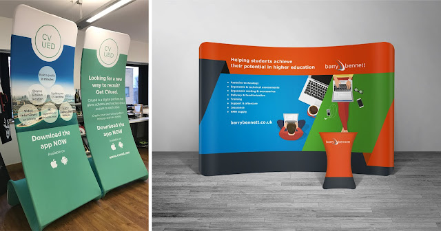
Looking for a cost effective way to stand out from the crowd at your next exhibition? Moving on from the usual pull-ups and pop-ups, there is a new style of stand around and it is perfect for exhibitions, easy to put up and washable! Fabric stands are all the rage!

Ever thought of lightweight fabric stands? 
Made up of just two main components – A strong, lightweight frame and a printed fabric cover. The printed cover fits snugly over the frame and can be printed both sides giving your brand more presence. Secured in place by a zip fastening, the cover is washable and changeable meaning additional covers can be printed so you can swap the design depending on the event.  

Great for large and small events or in the office
Available in a multitude of sizes and shapes including a more traditional pull up banner stand as well as straight or curved backdrops - similar to a pop-up. The printing technology gives vibrant colours making these fabric stands a strong presence. Perfect for small and large events as well as in the office, as backdrops or room dividers. 


More cost effective than traditional pop-up stands
Where as the traditional 3x3 pop-ups are made up of multiple panels that create visible join lines through the middle of the design, these bigger backdrop style stands remove the issue, as the fabric is one continuous piece. Options of adding lights and fabric graphic wrap tables and counters make a dynamic looking stand, which you will be proud to present and they cost less.

Transportation
These new fabric stands pack down into small lightweight bags – making them easy to transport.

Exhibitions are great place to meet potential customers and are perfect for showcasing you business, products and services. Stand out from the crowd with lightweight, portable fabric displays.

Head over to our offer page to find out about our latest design offer or have a look at our portfolio for more examples of large format design. If you would like further information about banner sizes and prices contact us here

Have a read of our latest case study all about our experience design the exhibition stand for Penguin Ventures.