Sunday, 1 May 2016

My Useful Guide: Understanding Imagery


It is said that a picture’s worth a thousand words and when it comes to imagery, quality is everything.

There are two main types of imagery used in design: vectors and Raster graphics. But what is the difference and how do you get the best out of your images?

Vector graphics
A vector graphic is made up of a series of paths, with points and curves. These paths make any shape, whether it’s a straight, hard-edged or curvy.


Vectors are made using design software such as Adobe Illustrator and are most commonly used for logos and illustrations. Vectors can be scaled up to any size with no loss of quality as the edges stay clean, smooth and most importantly, don’t pixelate. 


Raster graphics
Raster graphics, also known as bitmaps are images made out of a series of blocks called pixels. For example, images imported from your digital camera or photos found online will be raster graphics. The more pixels an image has the bigger the file size and the higher the quality. Popular file formats include Jpeg, GIF, Tiff and PNG.

Raster images can be scaled down in size with no adverse effects to the quality. The issue comes when scaling up. Enlarging a bitmap can cause the image to lose quality and become blocky and ‘pixelated’, making the image look blurry. Commonly referred to as a low resolution image.

Raster images provide a detail and depth of colour that can’t be achieved by vectors, which are generally made up of solid colours or gradients.

Your Logo
All logos should ideally be vector based as it can then be reduced to fit on a business card or enlarged for billboards and the logo will still be the same high quality. If however your logo is a jpeg, the quality will be heavily compromised when scaled above its original size.

In most cases a business will require both photography and vector graphics across their marketing material.

ACHIEVING HIGH QUALITY IMAGES

Stock versus personal photography – Which is best for your business?
Is it best to use stock imagery sites and download an image from an online catalogue? Or do you employ a professional photographer and build up your own in-house photo library?

Stock photography
Time is the biggest advantage as images are available to download immediately, all you need is to sign up and buy credits and you’re away. Not only is it quick it is relatively cheap and there is a huge variety of images from a vast number of contributors.

One factor to consider when using stock imagery is that the images can be downloaded by anyone, any number of times. Meaning there is a chance that your customers and clients could see the same image elsewhere. The images also come with licensing restrictions that could include usage limitations and caps to print runs. Always make sure you are clear on the terms and purchase an extended licence if required. Stock websites such as Istock, Getty and Shutterstock are a great starting point.

Professional photography
If you want creative control and characteristic images then a professional photographer is for you. This is a more expensive way of starting an image library but it is well worth it.

You may have an idea of content but a professional will know how to achieve the most impact and will be able to direct and suggest ideas you may not have thought of. Take advantage of a half or full day shoot and work on achieving a series of shots rather than just one.

Creating an image library this way adds to the feeling of professionalism and quality that businesses should wish to instil. Most importantly giving you the resources to create impactful and targeted marketing material, enhancing your brand identity.

Professional photographers are a great investment for product photography. Achieving clean detailed shots with correct colour representation should be paramount when promoting products. With the aid of studio lighting, light boxes and props, a professional will show your products at their best.

If lifestyle images are what you need then a photographer will have access to all the supporting people you may need. Models, make up artists and artistic directors, with the knowledge of locations and backdrops all to suit your brand style. As an alternative to sourcing a location, why not use your own premises and staff and add a personal feel.

Professional photography has the best of both worlds. You can achieve the high quality, bright, well-styled shot of a stock image with the creative control and personalised representation you need to maintain your brand. Stock imagery will always be somebody else’s interpretation of the idea and not a true representation of your business and ethos. Working with a photographer will keep your marketing material true to character, helping to create a connection with your clients.

If you are after inspiration please have a look at our portfolio. Alternatively, if you need advice planning a photo shoot, The New Fat can help pull together everything you need.

Friday, 1 April 2016

My Useful Guide: Understanding Social Media


Facebook, Twitter, Instagram, LinkedIn. Love it or hate it, social media is becoming increasingly commonplace for businesses globally.

With Facebook achieving 1 billion users online in a single day just last year and approximately half of the worlds internet users utilising a whole host of social media platforms, how important could social media be to you and your brand?


What are the benefits?
Social media platforms are a great way to increase traffic to your website. Without it you are relying on people who know your brand or those who stumble upon your website after searching keywords. A social media presence with consistent branding and interesting content can very quickly get you known and recognised with retweets, shares and likes alone. Not only that but social media can help to increase search engine rankings as you become recognised as a source of relevant information and accomplished in your field.

In a way social media acts as the biggest and best endorsement to your brand and its ethos. The more followers, likes and shares you have the more confident people will feel about your brand. The beauty of social media for marketing is that word spreads far, wide and fast. With every person that follows you, there is opportunity for more followers and more brand awareness.

Instead of you finding the clients, how about letting the clients come to you?
Social media is a great way to interact with an audience and offers the opportunity for followers to approach you. Talking to existing or potential clients on a friendly, helpful level removes a sense of mass marketing that can quite often be the feeling when using traditional adverts and flyers. Social media adds a human element to business, adding to that feeling of loyalty and trust amongst your audience. Support you show to customers can also be seen by a much wider audience, acting as a testament to your customer service and reliability.

With around 30 million UK users and new accounts becoming active each day, take full advantage of the free marketing available at your finger tips. All it requires is a bit of time and careful consideration but the results could be tenfold.
  
Here are a few cheeky pointers for improving a profile:

Logo
It is important to make sure that your logo not only represents you (have a read of our February blog post about logos) but is identifiable and is suited to sitting in a square. Don’t try and fit too much into a small profile picture, you need to be recognised at a distance in a long list of tweets, posts and shares. Use a symbol or an element of your logo to represent your brand and expand on this with the rest of your profile page.

Colour
This is a great way to make you stand out but it is also important that your customer base recognises you. There is no point in having an orange Facebook or Twitter profile if the rest of your branding is blue.

Layout
It’s easy to let Facebook or Twitter adjust your profile images and banners but you should take control of how your profile looks! Make sure that your images sit in your profile banner correctly and are clear and concise. Upload an image that fits the dimensions of the space and ensure that anything vital isn’t stuck behind the profile picture or profile name. Now that more and more of us use our mobiles to access social media it is vital that you profile banner works on both a computer screen and the mobile version. Remember that Facebook crops into you profile banner on the mobile site.

Which social media platform is for you?
There are a number of social media platforms available online and through mobile apps. Have a look at our useful download to see which social media could be best suited to you and pick up some more top tips.

Let us help you to create brand consistency across your social media platforms by contacting us for a quote or for inspiration have a look at our social media portfolio.


Tuesday, 1 March 2016

My Useful Guide: Understanding Colour

Colour can have an enormous impact on the way we see and feel. It is perceived in different ways by different people, effecting usability and business marketing.

Surrounded by colour in everyday life it often goes unnoticed or unappreciated. 

Do you know what your brand colour is saying about you?
Blues emit tranquility and calm. Greens, freshness and environment. Yellows, happiness and energy. Purples convey luxury and wealth. Pinks, compassion and playfulness. Red, power and passion and orange, confidence and success. 


Our minds are programmed to respond to colour whether it's stopping at traffic lights or taking note of warning signs. Not only that, but colour can help us to process and store memories and as a result, brands are intrinsically linked back to their colours. It is thought that 80% of brand recognition is down to colour alone. It is the first cause of association, closely followed by symbols/shapes and finally words.

Once you have your brand colours how do you go about using and reproducing them?

Why it’s important to know CMYK and Pantone breakdowns
The Pantone colour matching system is a standardised range of colours. Pantone colour books are produced to allow designers, printers and the general public to choose, reference and control consistency throughout marketing both in print and online. With their own numerical reference, each colour has a swatch showing how it will appear on coated and uncoated stock. This allows designers and printers around the world to produce work with accurate colour reproduction each and every time.

Each Pantone colour (spot) has its own unique breakdown for CMYK (cyan - blue, magenta - pink, yellow and black) for print and RGB (red, green and blue) for web.

Pantone books let designers choose the closest possible CMYK, RGB and HEX value for each pantone colour – allowing CMYK reproductions to stay as representative of the brand colours as possible – i.e. in magazines and other publications which do not allow for special pantone spot inks to be used in the production process.

Things to know when printing your brand colours
Commercial printers will print in four colour process (CMYK) - printing these four colours at various percentages on top of each other produces a large spectrum of colour. However, due to the vibrancy of a colour, it may be necessary to print using Pantone spot colour to create the desired result. It is important to consider whether your colour can be recreated in a CMYK process right at the beginning, as printing spot colours will have an effect on future printing costs.

Paper stocks can also affect the outcome. Ink sits on the surface of coated paper making print appear bright and colourful. On uncoated paper, the ink soaks into the fibres and can leave colours looking dull and less vibrant. 

Pantone also provide metallic and neon colours - Offering almost endless opportunities to stand out from the crowd when it comes to your brand.

A designers input and brand guidelines
There are a number of colours at our disposal, providing consistency across your brand, also helping people with recognition and association of the brand. Finding the right colour can prove to be a great tool to have in your brand toolbox. Having a set of brand guidelines, even better. 

Brand guidelines are a set of rules for logo use, colour palette, typography and other visual devices, providing a fundamental style for communicating to your client base. Having a set of guidelines in place defines and promotes brand integrity.

After inspiration? Why not have a look at our corporate guidelines portfolio or have a look at our case study.

Monday, 1 February 2016

My Useful Guide: Understanding Logo Design


Quite often beautifully simple logos are the best at communicating the most - Getting it right is important

The Amazon logo: a basic font, plain colours and a simple arrow - not much to it! Well, that primitive arrow actually tells us quite a lot. 


We all know Amazon as a vast company that sells pretty much everything and that’s exactly what that arrow is eluding to . . . they stock everything from A to Z it even makes the logo smile. Clever eh?! 


FedEx: have you ever noticed the little arrow in the negative space between the E and the X? They are quite literally going places - proof that simplicity is quite often key.

Logos are the first form of communication for a business and say a lot about who you are and what you represent - they are an important glimpse into a companies personality! It’s crucial that your logo projects the right image for your business with maximum effect and minimal fuss.

Important questions you need to be asking yourself about your logo?

What do you want to say about you as a business? Are you fun with a quirky edge, professional and to the point, are you long established with years of experience?

It’s important to think about the kind of audience / industry you are hoping to attract? Young, old? Males, females? Couples, families, individuals? Maybe you want to attract frivolous people with cash to splash, or those looking for high quality but at a great price. There is a huge number of potential clients out there - you need to decide which of them you want to target. 

Are there any particular colours you want to use? Colours are great for expressing emotions and targeting that key audience, as well as helping people to identify you in a sea of competitors.

How are you going to use your logo, where will it be seen, what will it sit with? Does it need to work in its entirety or does it need to be identifiable by just an icon?

There is a number of things to think about and this is purely a starting point, if you want to find out more about commissioning a logo design we have a brilliant pdf you can download that is filled with useful information. Or take a look at this months case study.

Choosing a logo shouldn’t be stressful, it should be a fun experience and we are a team of designers with years of expertise - ready to help. Whether you have a basic brief or a specific concept we can help you realise ideas or show you a number of unique logo possibilities.

Why not have a look at some logos we have designed. For more information and to speak to the studio why not give us a call.

Wednesday, 30 September 2015

Plinth and graphic panel design for the B&Q Managers Conference


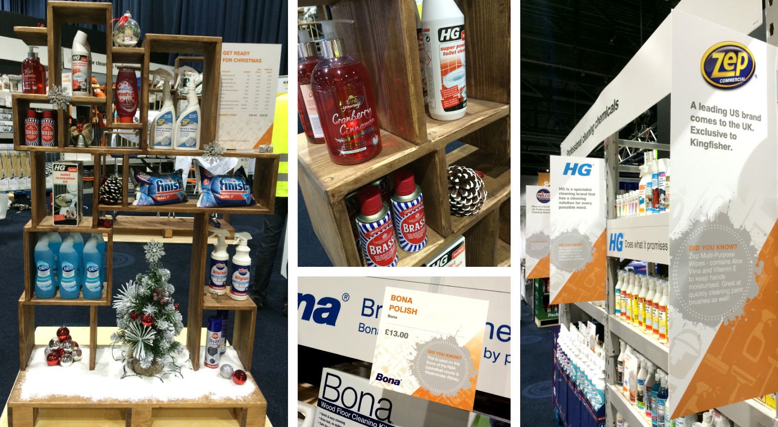
This month saw the B&Q Managers Conference descend on the Manchester Central Convention Centre, showcasing the up coming retail products for Q4 2015 to an internal B&Q audience.


The New Fat were commissioned to design and build an exciting way to display a whole host of cleaning products and winter motoring essentials. To name a few, we had clothes airers, washing up liquid, dishwasher salt, car sponges, screen wash and even an alloy wheel complete with tyre! Some would say “not the most interesting of items” but that’s where our creativity came into play!


The solution was a trio of staggered wooden box style, freestanding shelving plinths which framed each product perfectly. These were purpose built, so the audience could handle the products from both sides of the display.


We also designed a range of racking graphics, shelf wobblers, price list graphics, pull ups and counter graphics to compliment the stands.


On the day before the conference, two members of The New Fat team travelled up to Manchester to set up and dress the stand. It is always a hive of activity at the exhibition set up stage, people, products and props everywhere. We are very proud to help create impact at the B&Q internal event and loved strutting around in our high viz vests!


The result was met with high praise from all and deemed a great success, not only in design but in preparation, creation and execution!


“Thanks very much for such amazing support and the stand looked amazing and so many people commented on how we made cleaning look really good”
B&Q - Lead Buyer


“I second that, it was great that on the Tuesday you were able to dress up the area with little intervention, it did look great.
In addition the POS created for the shelving and storage area really enhanced the display.”
B&Q - Visual Merchandiser


Wednesday, 15 October 2014

Penguin Random House Exhibition Stand for Brand Licensing Europe 2014

For Penguin Random House at the BLE14 exhibition held at Olympia, London this month we designed and installed a retro living room complete with a window and garden. The brief was to come up with something a little different on a restrictive budget which represented both Random House Enterprises and Penguin Ventures under the one roof. We didn't go as far as a roof, however the final result was a perfect showcase for the licensed product opportunities of both brands and their respective properties. A reception area bringing everything together kept everything professional and clean. Very homely indeed. We look forward to helping out again next year :-)

Thursday, 24 October 2013

Brands Licensing Europe 2013 Exhibition


Here in the studio we love wall vinyls, and when the well known British brand of the Penguin Group asked us for some lovely logos to cover the walls of their stand we jumped at the chance! The display was called 'Penguin Licensing and Consumer Products' and was well received at the Brands Licensing Europe 2013 show.